Facets
Facetting
You can more easily compare subgroups of data if you place each subgroup in its own subplot, a process known as facetting.
facet_grid()
{ggplot2} provides two functions for facetting. facet_grid() divides the plot into a grid of subplots based on the values of one or two facetting variables. To use it, add facet_grid() to the end of your plot call.
The code chunks below show three ways to facet with facet_grid(). Spot the differences between the chunks, then run the code to learn what the differences do.
facet_grid() recap
As you saw in the code examples, you use facet_grid() by passing a rows and/or a cols argument, with the names of the variables inside a vars() function.
facet_grid()will split the plot into facets vertically by the values of therowsvariable: each facet will contain the observations that have a common value of the variable.facet_grid()will split the plot horizontally by values of thecolsvariable. The result is a grid of facets, where each specific subplot shows a specific combination of values.
facet_wrap()
facet_wrap() provides a more relaxed way to facet a plot on a single variable. It will split the plot into subplots and then reorganize the subplots into multiple rows so that each plot has a more or less square aspect ratio. In short, facet_wrap() wraps the single row of subplots that you would get with facet_grid() into multiple rows.
To use facet_wrap() pass it a variable name inside vars(), e.g. facet_wrap(vars(color)).
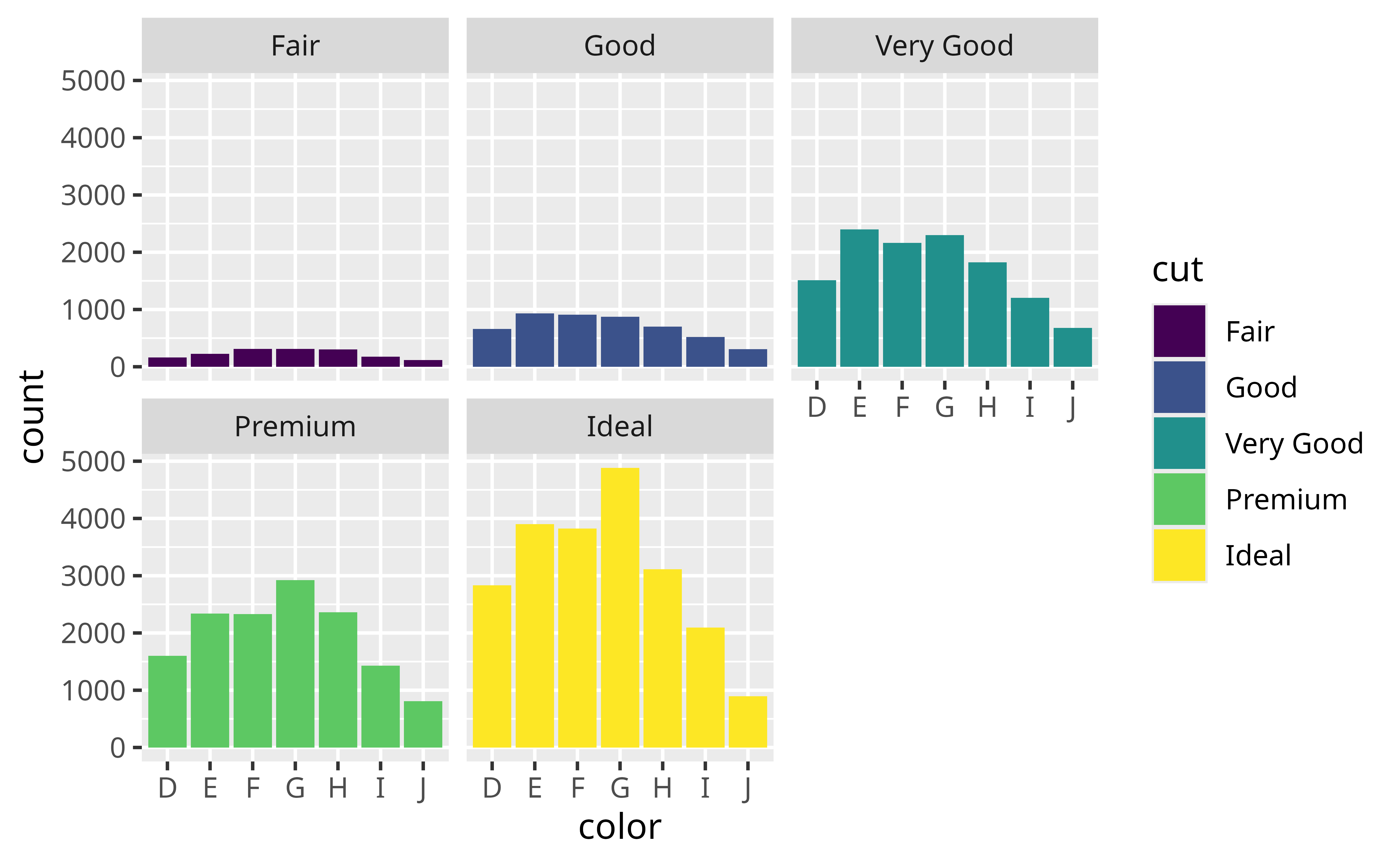
Add facet_wrap() to the code below to create the graph that appeared at the start of this section. Facet by cut.
ggplot(data = diamonds) +
  geom_bar(mapping = aes(x = color, fill = cut)) +
  facet_wrap(vars(cut))
scales
By default, each facet in your plot will share the same \(x\) and \(y\) ranges. You can change this by adding a scales argument to facet_wrap() or facet_grid().
scales = "free"will let the \(x\) and \(y\) range of each facet varyscales = "free_x"will let the \(x\) range of each facet vary, but not the \(y\) rangescales = "free_y"will let the \(y\) range of each facet vary, but not the \(x\) range. This is a convenient way to compare the shapes of different distributions
Try changing the scales argument from free to free_x to free_y to see how it works:
Recap
In this tutorial, you learned how to make bar charts; but much of what you learned applies to other types of charts as well. Here’s what you should know:
- Bar charts are the basis for histograms, which means that you can interpret histograms in a similar way.
- Bars are not the only geom in {ggplot2} that use the fill aesthetic. You can use both fill and color aesthetics with any geom that has an “interior” region.
- You can use the same position adjustments with any {ggplot2} geom:
"identity","stack","dodge","fill","nudge", and"jitter"(we’ll learn about"nudge"and"jitter"later). Each geom comes with its own sensible default. - You can facet any {ggplot2} plot by adding
facet_grid()orfacet_wrap()to the plot call.
Bar charts are an excellent way to display the distribution of a categorical variable. In the next tutorial, we’ll meet a set of geoms that display the distribution of a continuous variable.